tirsdag 18. oktober 2011

Colors and personal project

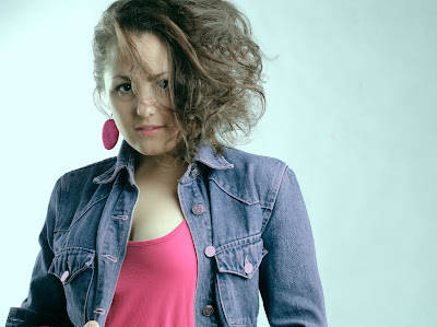
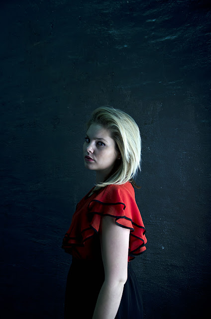
A few hectic weeks have passed, and new experiences have enriched my life. Last week I had to finish a project that I had about colors. We had to submit portraits incorporating complementary and adjacent/analogous colors. This means I had to use colors to create harmony, even if they are not next to each other on the color wheel and color combinations which blend well together and are close to each other in the color wheel.  

We could use makeup, clothing, environment, objects, etc. to create these effects. I also used Photoshop to achieve the desired result. One must be allowed to cheat a little sometimes. And my teacher thought it was okay, so I thought it was okay too. 

The first picture is definitely my favorite. I was so happy when I saw that it worked out this way. Currently this is also the front page of my new portfolio (printed version) that I have been working on over the past days. I'll tell you some more about this portfolio thing a little later


Anyway, as I was saying, this is my favorite. My teacher liked it too, and that made me even happier. To see how the color wheel looks like, you can click here: http://en.wikipedia.org/wiki/Complementary_color

I am also happy with the other images. We had a fun shoot with a lot of 80s music to set the mood. My model, Cecilia, and I chose to do a 80s theme for the images. Much dancing and head banging made the shoot a lot more fun, and there was a lot of laughter in the studio. Here's the rest of the photos. 


We wanted the last picture to be in brown tones, and the theme was Earth/soil/natural. We even used a fan, to create wind. Haha, how silly. But I think it worked out pretty good. Here is a different version of picture number three, with a more powdery look. 


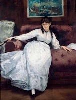
I have also during these past weeks been working on a special and a bit different project. It is for a class at school called 'Portfolio Development'. I've had this class before, but with another teacher. This "new" teacher (he is new to me, but he has been working at school for some years) is a very talented photographer, and I look forward to learning more from him. This particular project is our personal project. The first day we had class with this teacher, we got half an hour to decide what we would do as a personal project. We did not get a theme, description or any limitations or guidelines at all. We could choose whatever we wanted to do, and that was quite scary to be honest, but also exciting. I do not know exactly what I was thinking about or how I was thinking, but somehow I chose to be inspired by art - to be more precise, the art of ManetI wanted to recreate the feeling and looks of the people Manet painted in his pictures. 

If you have no clue on who this Manet guy is: http://en.wikipedia.org/wiki/%C3%89douard_Manet 


We all had to tell each other what we had chosen as our personal project. When it was my turn, I was really quite proud to tell everyone about my theme. But my teacher changed that fast. He said that it would be difficult to achieve, and then he asked if I was sure about my decision. And I replied that I was sure. But in that moment I felt that I had made ​​a fool of myself. Could it really be that hard? He said that the Impressionists, like Manet, created light in their paintings in a very special way - and I had to take take into account. Wow! How on earth would I make that happen? I'm so new on this whole light thing. Alright, now there's no turning back. I have to make it happen! 


So, to make a long story short, I borrowed books on Manet and tried to study the light in every painting. I read about him in various encyclopedias and on the net and tried to understand how he painted his pictures. I went on an inspection and took photos of different locations to create my personal mood board. I experimented with outdoor lights, incandescent and colors. I tried out editing methods to get the right Manet-style

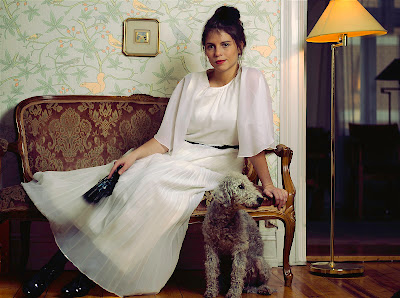
A week ago, I had a shoot with two girls in an apartment with big windows, afternoon sun and old furniture. It was very nice to get out of the studio, and to go to a location instead. I had a little trouble with the lamps that I was gonna use. Firstly, I could not use the two lamps I had booked for the shoot. They were destroyed. Instead I had to use one lamp with an umbrella and my sb 900 flash. Secondly, I didn't have a cable to connect with the unit so that it could use the electricity in the house. I had to use batteries. There were two of them, but they got discharged very quickly. So at the end of the shoot, I used only my flash. The plan was to use multiple light sources, in order to regulate the force relative to the amount of daylight coming in (as long as we had daylight. It was dark after a while). But even though it didn't go according to the plan, I was very pleased with the shoot. And I was fortunate enough to have my father-in-law with me that day. I could not have done it without him. 

Here are the pictures. 


These are the pictures I have been chosen and edited until now. I have not received any feedback from my teacher, because he had to cancel the class we were suppose to have last week. Hope he likes them. I am satisfied with the result. I also learned very much from this experience, like all the preparations for the shoot, the shoot itself and the postproduction. For instance I have used new editing methods that I have not known about before. So that was cool. 

I've also been printing a lot the last few days, so I could have printed images in my new portfolio. I had to buy an old-fashioned portfolio, a real one. From now on, it is not enough with showing my photos on a screen. Every week or so I have to print out the photos that I think works well, and keep on building it. The problem is that I do not really know what genre I should focus on. For the time being the portfolio has no flow. There is a little of this and a little of that. I personally feel that it doesn't represent me. I do not know what I want as a photographer. So that is something I have to work on. I plan to experiment more with advertising and commercial. Maybe that's what I should pursue. I really don't know. I am confused. My portfolio teacher thinks I should focus on conceptual photography. Maybe... 


And as if this post is not long enough, I totally forgot about my phobia/nightmare photos. A few weeks ago, I had a task that was about dreams. It could be pictures of good dreams, bad dreams, fantasies, fears or phobias. Here are my pictures.


I was not satisfied with the first picture, but the second one was better in my opinion. I got good feedback for that one. I will not go into detail about my dreams, fantasies, fears or phobias, but I guess it's pretty obvious what I do not like. This was one of the hardest tasks I've ever had, and I think it was tough to get the two images. But it is a very exciting topic, and I will definitely work more with it later in my spare time (whenever that will happen).

I have also begun to experiment with video. I am going to shoot a music video sometime after Christmas, and I need a band or an artist who is keen on getting a free music video. If you know anybody who does, please contact me. 


Next time you'll hopefully see some good commercial photography.


Stay tuned! 

mandag 3. oktober 2011

Forms and shapes!

Last week we learned about shapes and forms that you can use in an image. The expression of the image changes when you use a certain form, shape, pattern etc. There is much you can use in an image. Diagonal, vertical, horizontal, and curved lines can create different moods. A triangle pointing up, has a more harmonious expression, than a triangle pointing downward. At the same time circular composition gives a sense of harmony and an intact emotion. The circle is a universal symbol for unity


There are many symbols and elements used in photography. I will not go any further into all of these, but however, if you are interested, there is a book by David Präkel called "Basic Photography: Composition." It's a simple but great book to have, if you want to take pictures. 

So here are some of my pictures.


I got really good feedback for the last picture from my teacher. We both agreed that she looked like a mermaid, and that the silhouette of the body worked out pretty good and that the hands looked very nice. I was supposed to have submitted all the images in black and white (I didn't know this). I'm very fond of colors, and that's why I haven't changed them. 

Often I find it difficult to crop of the image when editing. I've told you earlier that I'm a sucker for the Rule of Thirds, but sometimes it just doesn't work. It's not always easy to say what is correct and what is wrong. You just gotta trust your guts... or eyes, or whatever.


This week is filled with new projects. I'm gonna experiment more with light, and try out more lamps (I've mostly used two). We were also told to choose a personal project within half an hour, and say it out loud to everyone afterwards. I got an idea I thought was good, but eventually I realized that I had dug myself a deep grave. And now I am not allowed to change my mind. I've no idea how I'm gonna make it happen! I will also experiment with colors (yey, colors!) and try to find colors that complement each other and colors that provide contrast in an image. It will be exciting!


Here is one of the test shots for this shoot. I liked it so much, I thought I would share it with you!  


Thanks for dropping by! 


PS: Unless you have already seen this, check out my Behance page: http://www.behance.net/gallery/Monica-Tormassy-Pictures-on-tour/2023361#.Tlc2_BFckps.twitter

søndag 2. oktober 2011

Silhouettes, sequence and everyday life.

Much has happened in my life since I blogged the last time. It's been two weeks! Without going too much into details, I can tell you that I have also been sick for a while now. But I'm on the road to recovery. Today I made breakfast for myself for the first time in a long time. And I felt inspired again! I can not tell you enough how much I really love photography. I so do! Ahh, and it breaks my heart when I think of the possibility of not being able to do it anymore. 

So, let me show you what I have done since the last time. It is a great deal. Again, I have had some boring tasks where I have had to show the difference between using a flash indoors and outdoors, with different objectives - and to measure the temperature of the light and see the difference between the different temperatures, etc., etc. Such tasks are not about the picture itself and do not communicate much, but we have to do them because it is practical, and we learn a lot. They are only test shots, so I'm not gonna show them to you. However, I'll show you some silhouettes. 

It's always fun to try something new, and I can tell you that I have never made ​​silhouettes before. It was a little difficult at first, to be honest. We had a lot of fun on this shoot, especially with all the posing that was required. It had to be a bit dramatical so it would look interesting. And we were all very creative when we were finding new ways to pose. It was a good day. 


I was going to put up more pictures, but it looks like the server failed to handle more than three silhouettes. Sorry folks! Moving on to the next thing. 

I had to make a sequence as well the same week. We had the chance to choose whatever we wanted, and many people in my class chose to take a pictures of their food as it becomes less and less on the plate. I chose to focus on facial expressions and took pictures of Sophia. She was getting tired for sure. A picture speaks a thousand words, right?


I got good feedback for the sequence. My teacher said that although he usually hates the color I've used in the pictures, he likes it in this setting. I don't usually use this greenish-sepia-color, but I wanted to achieve an old film vibe also because of the way the images are put together. Instead of having it in black and white. What do you think? Do you also hate the color as much as my teacher and me? He liked the fact that she looked like an adult. Almost like a little person who is nervous before a giving a speech.

The next thing we had to do was to read a text by Paul Graham, called "Photography is so easy ... ... ...". If you want, you can read it here: http://www.americansuburbx.com/2009/07/theory-paul-graham-photography-is-easy.html

We had to let Paul Graham's text inspire us to create a daily diary from our lives (a series about what you observe around you when you begin to see). 


I decided to use my analog images to demonstrate what is around me.


I have not learned to scan the negatives yet, so these images have been photographed with my digital camera but not manipulated. That's the beauty of analog images. They are as they are. No changes, and no possibility of deleting if you are not happy with the result. The film that I've used for the color images is the Kodak Portra 160. It gives a finer grain structure and a natural skin tone reproduction. You can read more about it here http://www.kodak.com/global/en/professional/products/films/portra/160main.jhtml

For the black and white, I've used Ilford Delta 100. This is a very expensive film if you want a lab to develope your negatives and also make the copies. You can read more about it here: http://www.ilfordphoto.com/products/product.asp?n=8

I'll try to put up more analog shots when I'll have the time. The camera that I use, is a Minolta XE-7, with a 50mm f1,7.

Here is a picture of me with the camera.


So now you know how my Minolta looks like, and how my Minolta and I look like together!

That's all for now, folks! Maybe I'll write a new post very soon. Next time I'll be talking about phobias, dreams and shapes. Stay tuned!


PS: I need models every week. Please contact me if you live in Oslo, or if you can come to Oslo for a photoshoot. I don't ask for a perfect body or a flawless face, and you don't need experience with modeling. We'll figure it out! My e-mail is monica_tormassy@yahoo.no. You can also find me on facebook: Monica Tormássy, or on Twitter. Thanks!


søndag 18. september 2011

Portraits, portraits, portraits!

In my previous post I mentioned that I would put out some pictures from the shoot earlier this week. The task we got was the following:
 
1) SELF-PORTRAIT: This task will result in 3-4 photos, and represent a classic photographic approach - to portray yourself!


PORTRAIT OF SOMEONE ELSE - OTHER PERSONS: You go from portraying yourself to portray others. You are free to decide how to perform the mission, but we would like to see two different images.


I had so much fun taking pictures of my brother's girlfriend. She is very pretty and always smiling, but I really wanted to try to bring out other aspects of her. Here are some of the pictures. 


The selection process was tough. I do believe I shot over 500 photos. I might post some more of these pictures from this shoot as soon as I get time to edit them. They are good, and they should therefore be shared with you guys. I had to take pictures of myself too. It was a little unpleasant at first. Personally I feel that I have no control when I have to do a self-portait. I do not know exactly what I am taking picture of. These pictures were not as nice as I had hoped for. Here they are! 


My teacher really liked the last picture. I got very good feedback for this photo. People said it was convincing. That it was a credible photo. The other pictures I took were pretty and all, but nothing more. I have to start daring a little more and try out alternative solutions to get it to tell the viewer something - to tell a story. It's so good to receive positive feedback, but also criticism. Both good and bad criticism. I really really appreciate it. As long as it is constructive criticism that gives me something to work on. So it gives me a chance to improve. That's why I'm at school. To learn about techniques and everything, to get guidance and advices, to get inspired, to get an environment and a network, and to be criticized. The same applies to everything I post here on my 'phoblography'. Feel free to comment on the posts and tell me what you think. I want to learn as much as possible, and I am willing to work hard to be the best as I possibly can. Now, enough about that. Let's go on to the next task, which was the following:

2) AUTUMN: A new season is here and with a single image you portray the fall and how our surroundings and we are affected!


Here we were told that there should not be any pictures about leaves and such typical autumn symbols. I had a brainstorming while I had a cup of coffee outside at a cafe in the neighborhood. I thought about all the things that I feel touches the theme of autumn. The weather has changed and it's colder and often raining. The nature is lovely with all the different colors and all, and people have to wear thicker jackets and sweathers etc. - but is there something else going on? I began to think about the bikini season. That it's over, and people can stop with all the stress related to appearance and flat tummies. My idea was to first find a shelf in a store where hair removal products were on sale. I could not find anything that was visually good, but then I came across a small shop that had two full shelves with sunscreen on sale. So this is the result!  


 From a technical point of view the picture is not very good. What I could do in a narrow and small store with bad light and a lot of people trying to get pass me while I was taking pictures, was indeed limited. So I had to be quick, beacuse I was in the way for the customers. If I would have the chance of bringing my own lamps, and if the space would be bigger - I think the result would be better too. But I had to the best I could even though the circumstances was not the best. Anyway, the idea was good, but the result wasn't. You learn as long as you live, I guess. 

Tomorrow's the beginning of a new week with new experiences and new tasks. I am looking forward to the challenges and I am looking forward to take lots of new pictures. Stay tuned for new updates. NEW, NEW, NEW!